
Article · October 2023
A report and a presentation are entirely different tools — treat them that way. By Edouard Gruwez.
Many people need to present reports in management meetings, often with pre-defined templates and lots of numbers: financial reports, project proposals, market studies, business plans, budget proposals. It might seem easy to copy-paste the figures into a PowerPoint and call it a day. But many struggle to engage their audience and get the message across. Why is it so difficult?
Because we make presentations that mimic the function of the report. We rarely take the time to decide what is relevant; often our bosses require us to report on "everything". We end up with 100 slides which we must flick through quickly, because we were only allocated 20 minutes. And since the audience gets a pre-read and the slides afterwards, why should they listen when they can just read everything at their own pace?
The solution: give your report and your presentation a different format and structure. They should be entirely different tools.
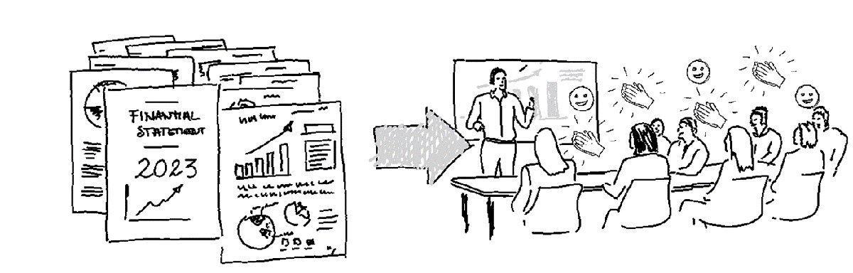
A key feature of reports is that they are formally structured in sections — an appellative structure: a logical sequence, categories, geographical areas, chronological phases. Think of a financial statement (income statement → balance sheet → cash flow) or a project report (initiation → setup → phases → closing). That structure exists so a reader can look things up.
A presentation, on the other hand, should follow a narrative structure. You need a story to tell. What are the insights you extracted from your report? What is the data telling you? The most effective way is a chain of statements linked by (silent) questions — the questions your audience would actually ask, like a natural conversation. Start from your key statement and go deeper into detail from there.
Once your story is structured, add elements from the report as proof points. Your narrative does not need to follow the order of the report's sections — pick from any section what supports your message. A narrative structure also shrinks the deck: where you had 100 slides of report data, you now need 5 to 30 at most. Slides are a visual aid, not a document to read.
A report has a pre-defined, fixed format — typically an A4 document or a PDF deck — with an elaborate table of contents that guides the reader to the right section. The templates are set; the tables are set; observations are added as text. The formatting is deliberately robotic and does not change from one report to the next. That is a feature, not a flaw.
The formatting of a presentation should be dynamic: bespoke slides that extract the most important information for this audience in a clear form. Do not regurgitate all your data onto the slide and let the audience decode it — twenty people in the room will reach twenty different conclusions. And remember: you have lived with this data for weeks; your audience gets minutes. Give them the best chance of understanding with simple, clear and complete language.
Creating a report is a straightforward process: sections and templates are established, and you should not make last-minute changes to structure or layout based on the data. No need to beautify pages or add photos, stories and emotion. The design is frugal. It is what it is.
Creating a presentation is a process of discussion, adaptation, visualisation and — yes — beautification. You are telling a story that has to reach your audience. What do you want them to look at, and when? What should they feel when they see your visuals? The images should strengthen your ideas and words.
Separate the report document from your story. Each has its own structure, format and design process. A final test: if you can print your presentation slides as a PDF, hand them to someone, and they do the same job the report would — red flag.